
 addisin:
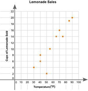
Eric plotted the graph below to show the relationship between the temperature of his city and the number of cups of lemonade he sold daily: A scatter plot is shown with the title Lemonade Sales. The x-axis is labeled High Temperature, and the y-axis is labeled Cups of Lemonade Sold. Data points are located at 30 and 4, 40 and 6, 40 and 8, 50 and 2, 55 and 10, 65 and 14, 70 and 16, 75 and 14, 85 and 19, 90 and 20. Part A: Describe the relationship between the temperature of the city and the number of cups of lemonade sold. (2 points) Part B: Describe how you can make the line of best fit. Write the approximate slope and y-intercept of the line of best fit. Show your work, including the points that you use to calculate the slope and y-intercept.
 Razor:
That's the image for the question, right? @addisin
Join our real-time social learning platform and learn together with your friends!
VERNEISH:
Two objects are moving along separate linear paths where each path is described by position, d, and time, t.

 Maci:
what are the best stock apps for people who want to start investing?
Maci:
what are the best stock apps for people who want to start investing?
 Twaylor:
genuienly how do i get better self control i keep watcing youtube and theres this
Twaylor:
genuienly how do i get better self control i keep watcing youtube and theres this
 IzzyCookie:
|dw:1792074056138:dw| Uhm, I don't know where to ask this, but I'm in college welding at my community college, and I need help learning vertical welding for
IzzyCookie:
|dw:1792074056138:dw| Uhm, I don't know where to ask this, but I'm in college welding at my community college, and I need help learning vertical welding for

 thehearken:
not sure if this is considered spam, im sorry if it is, but does anyone have tips
thehearken:
not sure if this is considered spam, im sorry if it is, but does anyone have tips