 XMarbleSkullX:
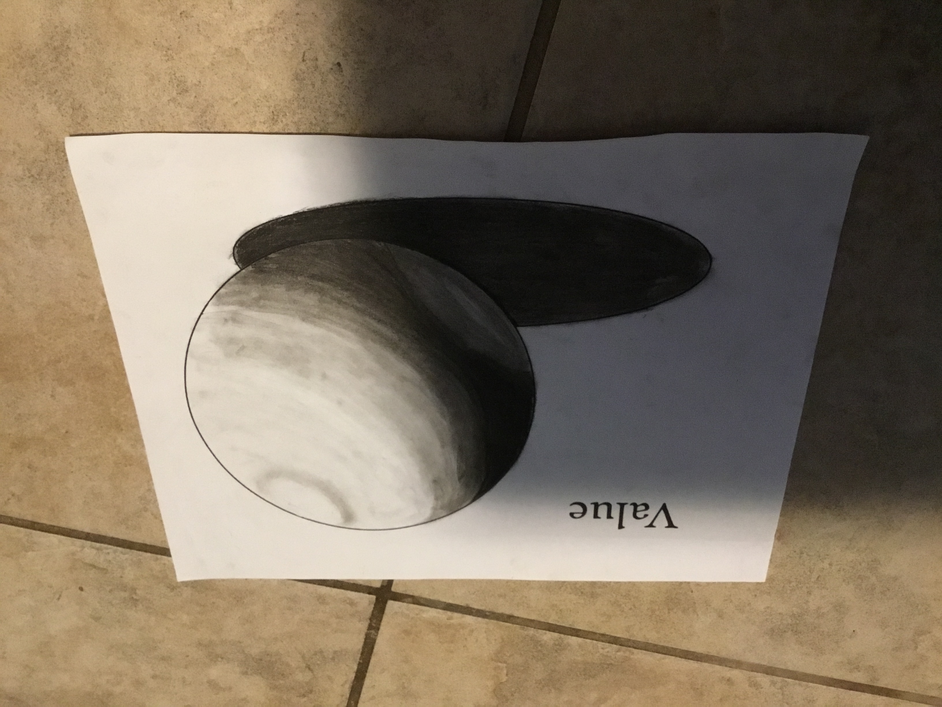
So, what can I improve? {Art posted below}
 freshavacado850:
hot
 Sweetie145:
nun
 mxddi3:
hm, on the shadow, there are spots in the same area that are different values. like, on the left, it's a bit light at the edge and then dark right next to that. it's not a super noticeable detail, but other than that, it looks pretty well (:
 CocoCammron99:
I love it, I personally don't think you have to improve anything
XMarbleSkullX:
\(\color{#0cbb34}{\text{Originally Posted by}}\) @mxddi3 hm, on the shadow, there are spots in the same area that are different values. like, on the left, it's a bit light at the edge and then dark right next to that. it's not a super noticeable detail, but other than that, it looks pretty well (: \(\color{#0cbb34}{\text{End of Quote}}\) Thank you! I'll keep that noted!
 HighDog224:
The shade Gives it life but I feel It Was empty with all that area not used to an advantage
 Ashely:
it is amazing. You made it perfectly
 UNO11034:
I don't think theres much you need to improve it looks pretty good already.
 Astrid1:
It looks good, Overall I say Quite good, Although It may be best... At the top of the ball, there's kinda a dark halo surrounding the outer edge of the ball, Idk if you see it. I am not sure if it's supposed to look like that, but that's all.
 Brittlynn1019:
I love it but there are some smudges. It will look neater if they aren't there
Join our real-time social learning platform and learn together with your friends!
 Twaylor:
Time flies doesn't it? I tried to not be the second squeaky wheel of the household and ended up hurting myself and others severely.
Twaylor:
Time flies doesn't it? I tried to not be the second squeaky wheel of the household and ended up hurting myself and others severely.
 clllaaaaaire:
any tips? the quality isn't the best because I am using this site on my computer
clllaaaaaire:
any tips? the quality isn't the best because I am using this site on my computer
 Midnight97:
Kinda a roleplay story between me and my friend enjoy... Part one Forgive me for all the screenshots.
Midnight97:
Kinda a roleplay story between me and my friend enjoy... Part one Forgive me for all the screenshots.
 StevenisGhost:
what type of song should I make next, and will y'all go check out my new song on
Midnight97:
My drawing sure changed over the years look at these two pictures from 2024 to no
StevenisGhost:
what type of song should I make next, and will y'all go check out my new song on
Midnight97:
My drawing sure changed over the years look at these two pictures from 2024 to no
 EdwinJsHispanic:
"poem" love is So Beautiful to have. But it's so hard to have. At this point I don't know whether its worth the wait Or if it's just millions of miles to re
EdwinJsHispanic:
"poem" love is So Beautiful to have. But it's so hard to have. At this point I don't know whether its worth the wait Or if it's just millions of miles to re
EdwinJsHispanic:
"poem" love is So Beautiful to have. But it's so hard to have. At this point I don't know whether its worth the wait Or if it's just millions of miles to re
EdwinJsHispanic:
"poem" love is So Beautiful to have. But it's so hard to have. At this point I don't know whether its worth the wait Or if it's just millions of miles to re
 Breathless:
I don't know if this would be considered art, but its close enough I believe, Any
Breathless:
I don't know if this would be considered art, but its close enough I believe, Any