 Seafoam:
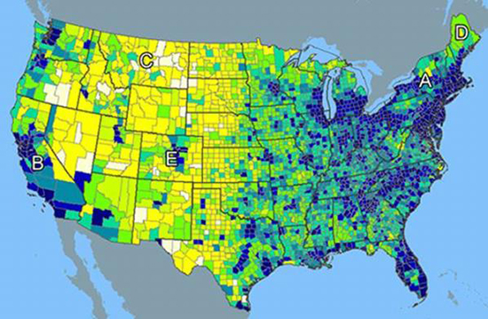
According to the gravity model, which two regions on the map would MOST LIKELY have the strongest pull? C and E A and D A and B D and E B and C
 Seafoam:
@AZ
 QuestionCoveBot:
What do you think it is?
Seafoam:
*sigh* I do not know, that is why I'm asking?
Seafoam:
I'm sorry if that came off as rude
QuestionCoveBot:
e.e Okay. And it didn't. Can you explain to me what the different colours mean, if you know what they do mean?
Seafoam:
I do not know what the colors mean
Seafoam:
Maybe lower and higher population densities
Seafoam:
Oh I thought it meant something of an economic pull towards places
 AZ:
AZ:
LOL WHAT
QuestionCoveBot:
\(\color{#0cbb34}{\text{Originally Posted by}}\) @AZ LOL WHAT \(\color{#0cbb34}{\text{End of Quote}}\) Ik ik. xd I'm wrong. I just realized.
Seafoam:
Why do I feel an AZ lecture coming... 😂
AZ:
I just started googling terms so I could get a better understanding of the question Yes, that image is indeed a population density map "The gravity model of international trade in international economics is a model that, in its traditional form, predicts bilateral trade flows based on the economic sizes and distance between two units." https://en.wikipedia.org/wiki/Gravity_model_of_trade "The gravity model can be calculated as the product of the population sizes, divided by distance squared, or S = (P1 * P2) / (D * D). What this shows is that the bigger and closer places are, the more influence they're likely to have on each other." https://study.com/academy/lesson/the-gravity-model-definition-use.html
A and B is the answer
AZ:
So the strongest pull is going to be where you have two points that are close together with higher populations
Seafoam:
Alright thank you :)
AZ:
\(\color{#0cbb34}{\text{Originally Posted by}}\) @Tawnie A and B is the answer \(\color{#0cbb34}{\text{End of Quote}}\) This is wrong, by the way A and B while very densely populated are VERY far away from each other and remember that it's distance^2 in the DENOMINATOR so that would reduce the pull a lot
Seafoam:
Is it A and D
AZ:
Bingo
Seafoam:
Great thanks again :)
AZ:
No problem!
Join our real-time social learning platform and learn together with your friends!
 Twaylor:
Time flies doesn't it? I tried to not be the second squeaky wheel of the household and ended up hurting myself and others severely.
Twaylor:
Time flies doesn't it? I tried to not be the second squeaky wheel of the household and ended up hurting myself and others severely.
 clllaaaaaire:
any tips? the quality isn't the best because I am using this site on my computer
clllaaaaaire:
any tips? the quality isn't the best because I am using this site on my computer
 Midnight97:
Kinda a roleplay story between me and my friend enjoy... Part one Forgive me for all the screenshots.
Midnight97:
Kinda a roleplay story between me and my friend enjoy... Part one Forgive me for all the screenshots.
 StevenisGhost:
what type of song should I make next, and will y'all go check out my new song on
Midnight97:
My drawing sure changed over the years look at these two pictures from 2024 to no
StevenisGhost:
what type of song should I make next, and will y'all go check out my new song on
Midnight97:
My drawing sure changed over the years look at these two pictures from 2024 to no
 EdwinJsHispanic:
"poem" love is So Beautiful to have. But it's so hard to have. At this point I don't know whether its worth the wait Or if it's just millions of miles to re
EdwinJsHispanic:
"poem" love is So Beautiful to have. But it's so hard to have. At this point I don't know whether its worth the wait Or if it's just millions of miles to re
EdwinJsHispanic:
"poem" love is So Beautiful to have. But it's so hard to have. At this point I don't know whether its worth the wait Or if it's just millions of miles to re
EdwinJsHispanic:
"poem" love is So Beautiful to have. But it's so hard to have. At this point I don't know whether its worth the wait Or if it's just millions of miles to re
 Breathless:
I don't know if this would be considered art, but its close enough I believe, Any
Breathless:
I don't know if this would be considered art, but its close enough I believe, Any