 yy:
yy:
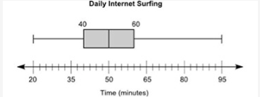
The box plot below shows the total amount of time, in minutes, the students of a class surf the Internet every day: A box plot is shown. The left-most point on the plot is 20 and the right-most point is 95. The box is labeled 40 on the left edge and 60 on the right edge. A vertical line is drawn inside the rectangle at the point 50. Part A: List two pieces of information that are provided by the graph and one piece of information that is not provided by the graph. (4 points) Part B: Calculate the interquartile range of the data, and explain in a sentence or two what it represents. (4 points) Part C: Explain what affect, if any, there will be if an outlier is present. (2 points)
yy:
just PART C AND B
yy:
not A
yy:
plz
yy:
help
 Questionnare:
Hi. Can you post a picture of the box plot? I did this same class last year, and I can help.
yy:
yae

 Questionnare:
Do you know any of this?
yy:
a little
yy:
Questionnare:
well, the interquartile range is the middle part where the rectangle-shape is.
Questionnare:
that is between 40 and 60.
yy:
ty @404
Questionnare:
why did it get closed
yy:
sorry
Questionnare:
thats ok
Questionnare:
well, you subtract q3 - q1
yy:
@404 texed ne in personel text how to get the answer
Questionnare:
oh ok =
 404:
404:
Questionnare I appreciate you trying to answer you do deserve the medal more than I.
Questionnare:
yeah i think all 3 of us did/do lake county virtual
Questionnare:
or flvs at least
yy:
what
Join our real-time social learning platform and learn together with your friends!
 Twaylor:
Time flies doesn't it? I tried to not be the second squeaky wheel of the household and ended up hurting myself and others severely.
Twaylor:
Time flies doesn't it? I tried to not be the second squeaky wheel of the household and ended up hurting myself and others severely.
 clllaaaaaire:
any tips? the quality isn't the best because I am using this site on my computer
clllaaaaaire:
any tips? the quality isn't the best because I am using this site on my computer
 Midnight97:
Kinda a roleplay story between me and my friend enjoy... Part one Forgive me for all the screenshots.
Midnight97:
Kinda a roleplay story between me and my friend enjoy... Part one Forgive me for all the screenshots.
 StevenisGhost:
what type of song should I make next, and will y'all go check out my new song on
Midnight97:
My drawing sure changed over the years look at these two pictures from 2024 to no
StevenisGhost:
what type of song should I make next, and will y'all go check out my new song on
Midnight97:
My drawing sure changed over the years look at these two pictures from 2024 to no
 EdwinJsHispanic:
"poem" love is So Beautiful to have. But it's so hard to have. At this point I don't know whether its worth the wait Or if it's just millions of miles to re
EdwinJsHispanic:
"poem" love is So Beautiful to have. But it's so hard to have. At this point I don't know whether its worth the wait Or if it's just millions of miles to re
EdwinJsHispanic:
"poem" love is So Beautiful to have. But it's so hard to have. At this point I don't know whether its worth the wait Or if it's just millions of miles to re
EdwinJsHispanic:
"poem" love is So Beautiful to have. But it's so hard to have. At this point I don't know whether its worth the wait Or if it's just millions of miles to re
 Breathless:
I don't know if this would be considered art, but its close enough I believe, Any
Breathless:
I don't know if this would be considered art, but its close enough I believe, Any