 Bob:
Bob:
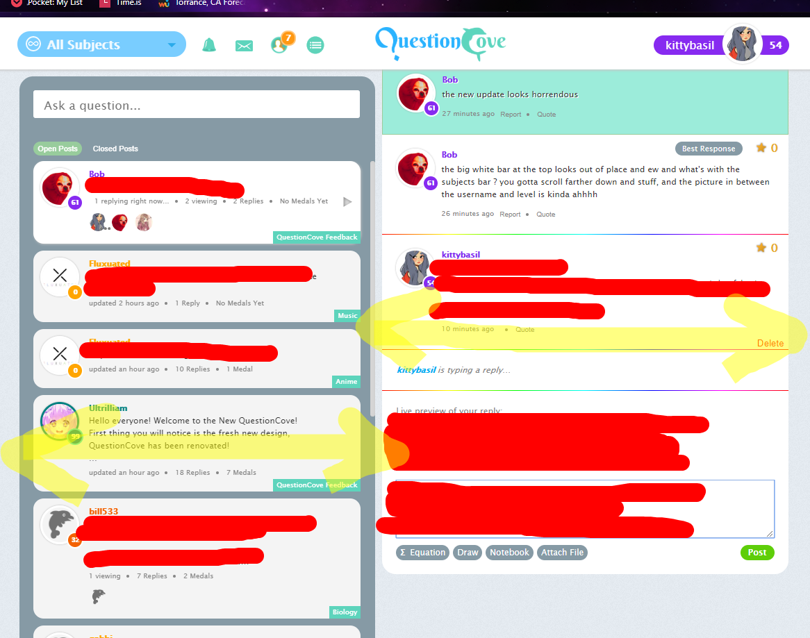
the new update looks horrendous
Bob:
the big white bar at the top looks out of place and ew and what's with the subjects bar ? you gotta scroll farther down and stuff, and the picture in between the username and level is kinda ahhhh
 kittybasil:
Honestly yes... about the scroll part And the bar is a little bright in contrast to the dim grey background of the remainder of the site. But the aesthetic otherwise is pretty on point
kittybasil:
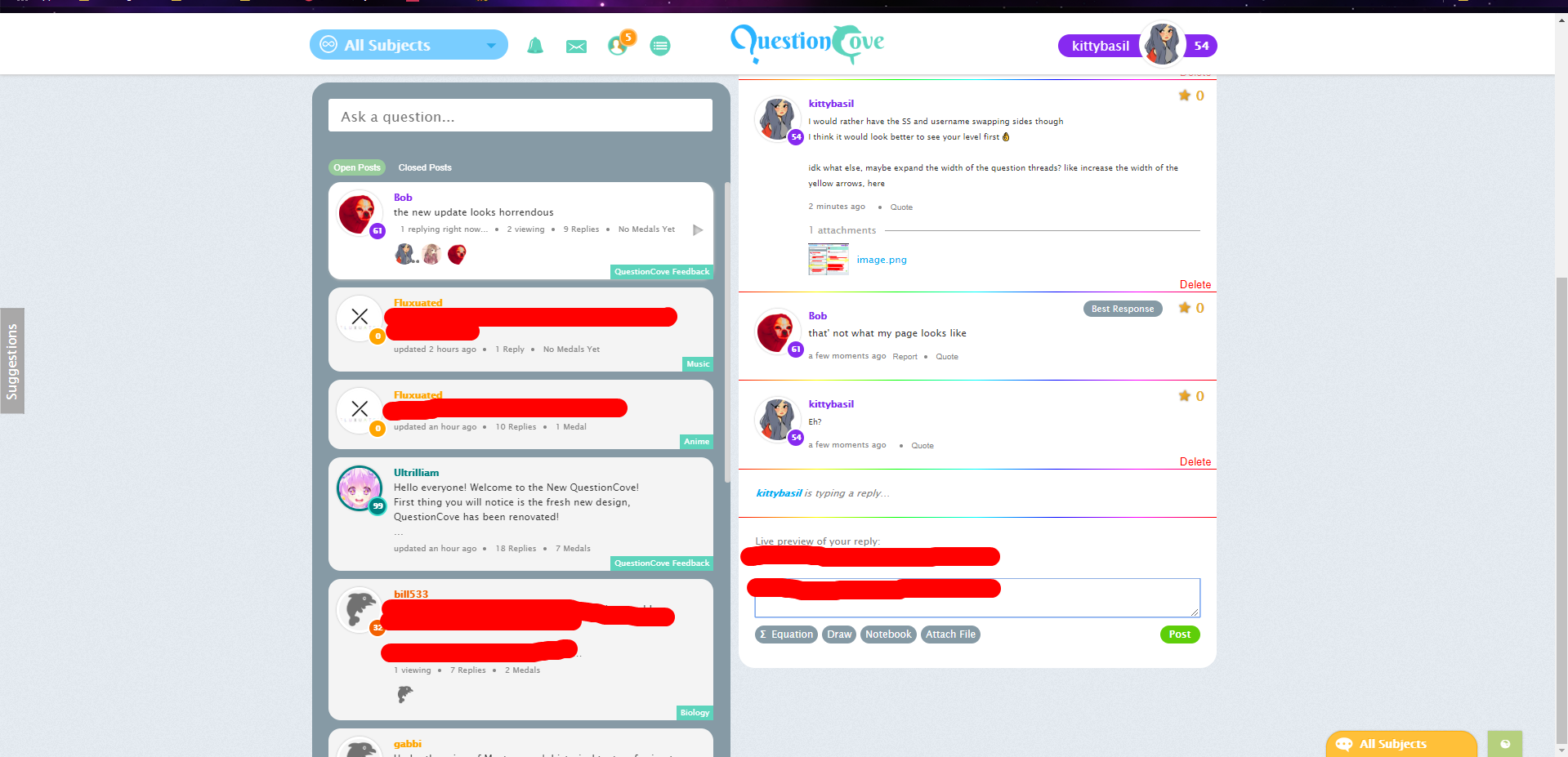
I would rather have the SS and username swapping sides though I think it would look better to see your level first 👌 idk what else, maybe expand the width of the question threads? like increase the width of the yellow arrows, here
 kittybasil:
Eh?
 dude:
dude:
It looks cool

kittybasil:
I have that on too, lmao
But what's that one that's Google Now based...
dude:
Bob if you don't want the updated theme you can enter classic into the codes
kittybasil:
It's a glitch, it sticks the name from the most recent notification to the rest of your "new notifications"
dude:
I was going to say kind of you for that test, I know its a glitch
kittybasil:
kittybasil:
Oh, you can zoom if you do the img bbcode.
dude:
Yeah
dude:
OS-QC code

kittybasil:
I want that list of QC code themes tbh
 iYuko:
we won't stop we can't stop
iYuko:
all users must be converted
kittybasil:
I'm playing Supernova right now
iYuko:
I have photo shoot tomorrow and I got a pimple today
kittybasil:
buy women's foundation
iYuko:
so just tryin to not die rn
iYuko:
I told my friend to bring some but were not same tone.
iYuko:
and its at like 6 am
iYuko:
don't have time go buy some Potato
kittybasil:
Quick go to the local Wal-Mart.
kittybasil:

iYuko:
oh my god
kittybasil:
WTH THIS IS NOT A REAL DOG I SWEAR

iYuko:
facetuned doggo
 iYuko:
demi
iYuko:
she's alive
 Sazzie:
The love of a phone😂 Not a big change on a phone version. Just no "menu" button.
Bob:
@kittybasil dOg aBuSE yOu dIsGUsTinG hUmAN
kittybasil:
Ok?
Join our real-time social learning platform and learn together with your friends!
 Bounty:
the world keeps moving fast and I'm stuck in a time lapse all I need is a minute
Bounty:
can I get so tips on how to start my journey into semi-realism art also on how to
Bounty:
the world keeps moving fast and I'm stuck in a time lapse all I need is a minute
Bounty:
can I get so tips on how to start my journey into semi-realism art also on how to
 Strawberryluna:
Read my poem. Im not for criticism its a poem I wrote after my breakup: Youu2019ll never understand the way you made me break, I hate that I still love you
Bounty:
first poem in a min- (tittle)? one moment i'm fine I smile till my face burns I laugh till I cant breath Then I cry I wonder where I went wrong I listen to
Strawberryluna:
Read my poem. Im not for criticism its a poem I wrote after my breakup: Youu2019ll never understand the way you made me break, I hate that I still love you
Bounty:
first poem in a min- (tittle)? one moment i'm fine I smile till my face burns I laugh till I cant breath Then I cry I wonder where I went wrong I listen to
 Twaylor:
3d printing a glider (for 150 pound 5'8 person - prolly should make it for up to
Twaylor:
3d printing a glider (for 150 pound 5'8 person - prolly should make it for up to
 cullenn:
pitter patter sound of rain gently tapping my window tonight. calming, soothing, right? not for me.
cullenn:
pitter patter sound of rain gently tapping my window tonight. calming, soothing, right? not for me.

 Arriyanalol:
DON'T BUY TICKETS TO SEAWORLD i watched a documentary on seaworld and its sad wha
Arriyanalol:
DON'T BUY TICKETS TO SEAWORLD i watched a documentary on seaworld and its sad wha
 natalieee:
who else wants a job in biology? I love biomedical science and want to work with
natalieee:
who else wants a job in biology? I love biomedical science and want to work with