 rootbeer003:
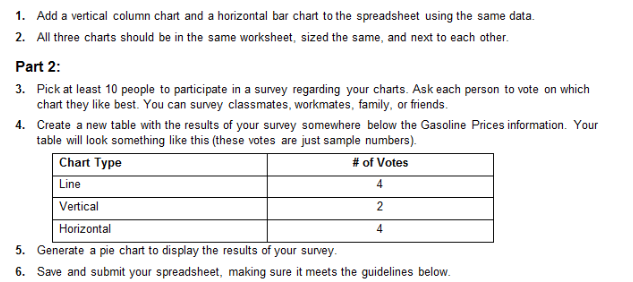
Excel help
 rootbeer003:
@Ultrilliam
 Ultrilliam:
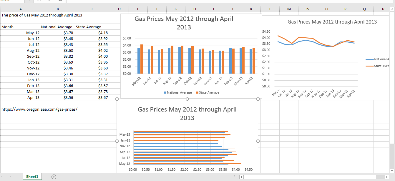
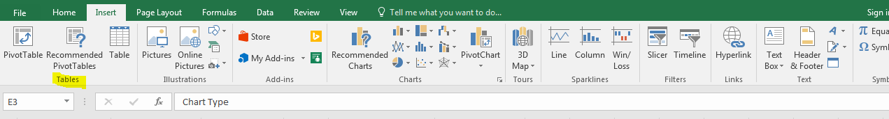
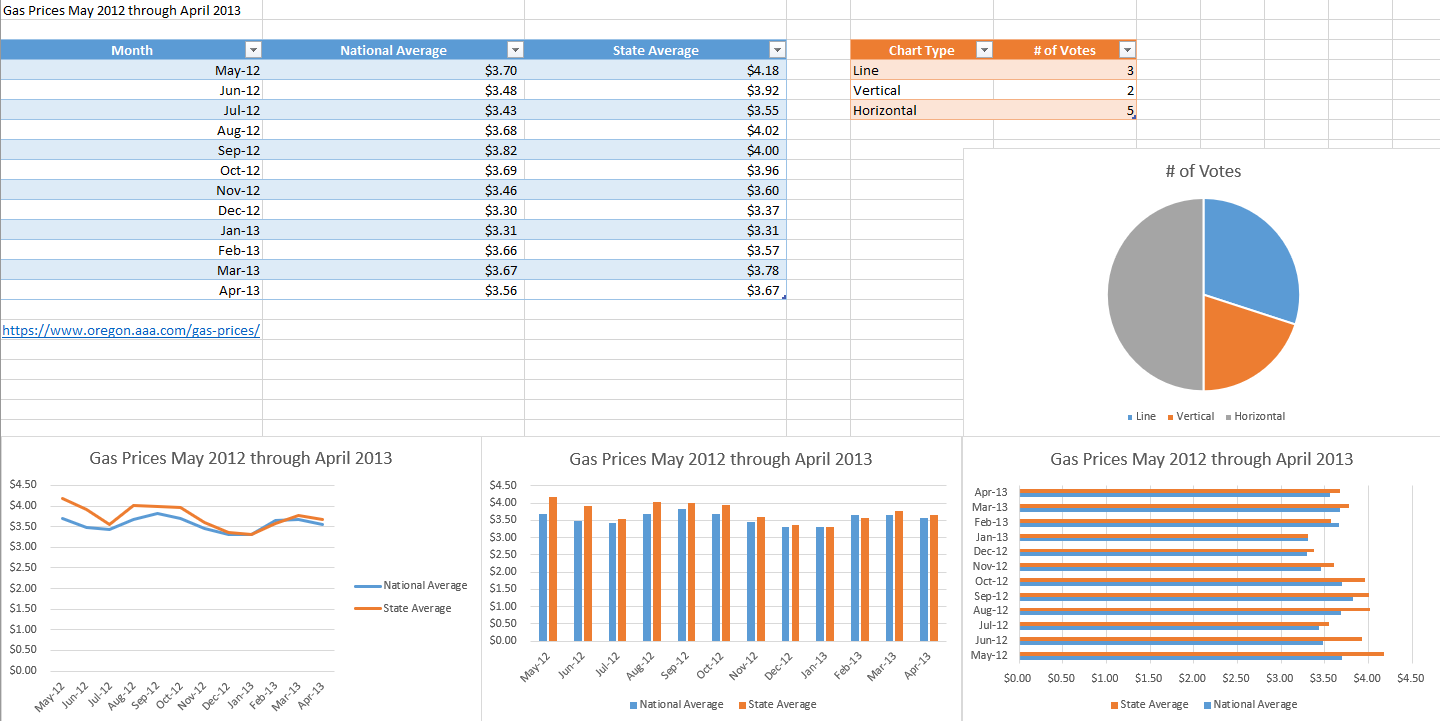
Sorry, didn't see this until now. Go to the insert tab on excel, select the data from the previous assignment (A3-C15) and hit "recommend charts" You should see a clustered column, choose that one.
 Ultrilliam:
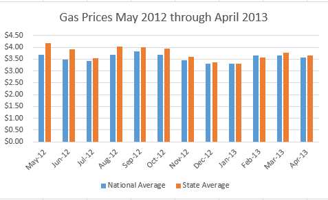
Don't forgot to change the name of the chart. For the next graph go to insert again, select your data, and next to recommend charts you should see something resembling a bar graph, click that (it's a small icon) and on the 2D bar charts, choose the clustered bar one (should be the first one)
 Ultrilliam:
@rootbeer003
 Ultrilliam:
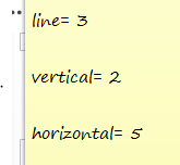
The first part of part 2 seems self-explanatory
Ultrilliam:
So I suppose lemme know when you have your votes
 rootbeer003:
@Ultrilliam
Ultrilliam:
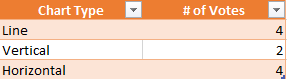
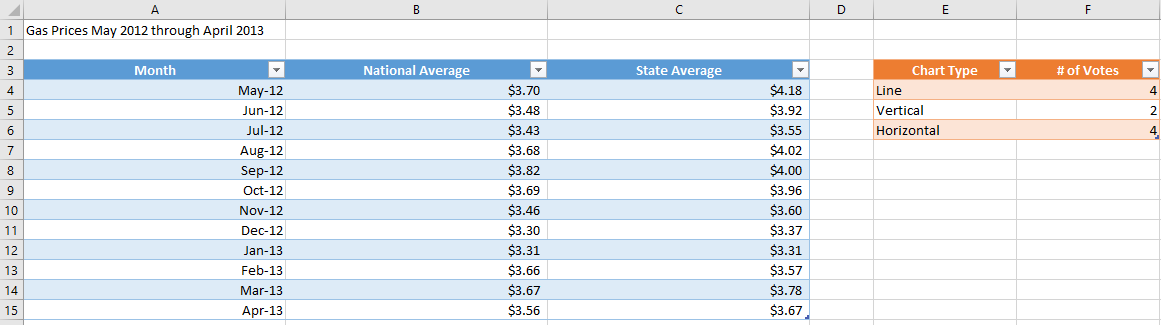
Now, next to where we previously had data lets make a table out of that, in columns E and F, and starting at row 3, put the data there like this (coloring will come after this)
 rootbeer003:
can u show where i should put that
 Ultrilliam:
Perfect, now select the data of the first table, (A3-C15) then go back to the insert tab and hit "table" do the same for the other table (but choose a different color) This isn't actually required but makes it look a bit nicer
Ultrilliam:
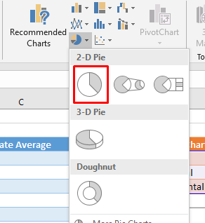
If you want to just skip that, next off go to insert and we're going to insert a pie graph
 rootbeer003:
not sure how to make the second table a different color
Ultrilliam:
At the very top you should see different table styles, if you hover over them it will show how it will look if you clicked it/applied it

 Ultrilliam:
Ah, you deselected the table. Click any of the cells in the table and you should see a new tab at the very top called "design" with "table tools" above it
rootbeer003:
okay got it
Ultrilliam:
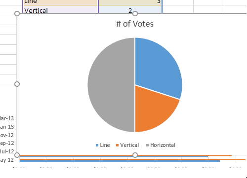
Do you have the pie graph as well or no?
 Ultrilliam:
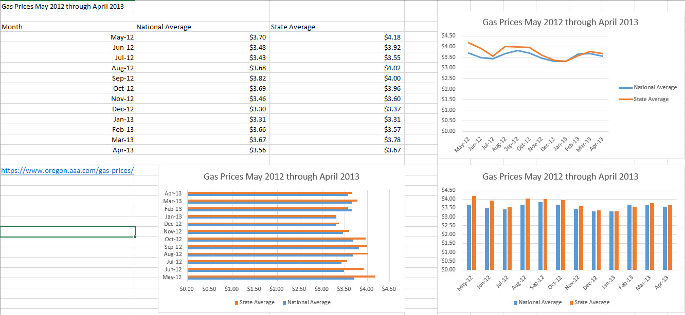
Perfect, and with that you're done! This is the file I ended up with at the end:
 rootbeer003:
Thank you very much ;3
Ultrilliam:
No prob bob
Join our real-time social learning platform and learn together with your friends!
 Bounty:
the world keeps moving fast and I'm stuck in a time lapse all I need is a minute
Bounty:
can I get so tips on how to start my journey into semi-realism art also on how to
Bounty:
the world keeps moving fast and I'm stuck in a time lapse all I need is a minute
Bounty:
can I get so tips on how to start my journey into semi-realism art also on how to
 Strawberryluna:
Read my poem. Im not for criticism its a poem I wrote after my breakup: Youu2019ll never understand the way you made me break, I hate that I still love you
Bounty:
first poem in a min- (tittle)? one moment i'm fine I smile till my face burns I laugh till I cant breath Then I cry I wonder where I went wrong I listen to
Strawberryluna:
Read my poem. Im not for criticism its a poem I wrote after my breakup: Youu2019ll never understand the way you made me break, I hate that I still love you
Bounty:
first poem in a min- (tittle)? one moment i'm fine I smile till my face burns I laugh till I cant breath Then I cry I wonder where I went wrong I listen to
 Twaylor:
3d printing a glider (for 150 pound 5'8 person - prolly should make it for up to
Twaylor:
3d printing a glider (for 150 pound 5'8 person - prolly should make it for up to
 cullenn:
pitter patter sound of rain gently tapping my window tonight. calming, soothing, right? not for me.
cullenn:
pitter patter sound of rain gently tapping my window tonight. calming, soothing, right? not for me.

 Arriyanalol:
DON'T BUY TICKETS TO SEAWORLD i watched a documentary on seaworld and its sad wha
Arriyanalol:
DON'T BUY TICKETS TO SEAWORLD i watched a documentary on seaworld and its sad wha
 natalieee:
who else wants a job in biology? I love biomedical science and want to work with
natalieee:
who else wants a job in biology? I love biomedical science and want to work with