 mhchen:
I have a massive data set of the U.S. census from 1994. It lists the surveyed person's age, education, marital-status, job, race, gender, capital-gain/loss, hours-per-week, native-country, and whether they make less than or more than 50k a year. What questions do you guys want me to find out? (The data set is from https://archive.ics.uci.edu/ml/datasets/adult)
mhchen:
Here's an example question with an example graph I made by myself "who is smarter, males or females" |dw:1570924234468:dw|
mhchen:
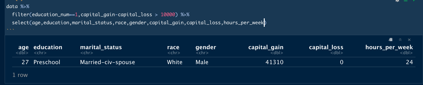
|dw:1570925095815:dw| every first-grade dropouts earned less than 50k :( sad
mhchen:
|dw:1570925188921:dw| Of course there's that one dude that wins the jackpot on investment I'm going to figure out who that point represents
 justjm:
Did you arrange all the data graphic or did you find it? I just want to know because it seems a bit interesting. Also wow, pretty cool data.
mhchen:
Yeah I'm using RStudio to make the graphics
justjm:
thank you
justjm:
Does it also find the data for you or do you need to find it yourself
mhchen:
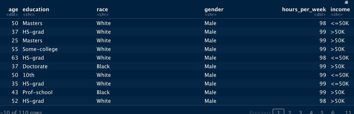
I downloaded the data on my computer. Then I use RStudio to rearrange the data however I want (like only view rows that are male and less than 50 years of age) and with my new data, I can draw plots with it the code looks like this: ```r data %>% group_by(education_num,gender) %>% summarize(n=sum(population)) %>% ggplot(aes(education_num,n)) + geom_line(aes(color=gender)) + theme_bw() + labs(title="Count of Education Levels by Gender",caption="Figure 1.2",x="education level",y="count") + theme(axis.text.x = element_text(angle=50,hjust=1)) ``` and the graph for that would look like this: |dw:1570926247203:dw|
justjm:
Ohh okay, thank you. Is it done on a terminal or its own platform?
mhchen:
On its own platform.
justjm:
Ah okay.
 Nnesha:
what does the 2nd graph represents?? how would you interpret it? Perhaps scatter plot is not the best graph to represent this data?
Nnesha:
did you label the horizontal axis or the software did ??
mhchen:
that was just me casually figuring out if any preschool-only educated people earned more than 50k. A scatter plot is the quickest to make so I just made it. the software automatically labels the axis but I can change the axis name
Nnesha:
okay. There are some things that can be done to organize the graphs.
Join our real-time social learning platform and learn together with your friends!
 Bounty:
the world keeps moving fast and I'm stuck in a time lapse all I need is a minute
Bounty:
can I get so tips on how to start my journey into semi-realism art also on how to
Bounty:
the world keeps moving fast and I'm stuck in a time lapse all I need is a minute
Bounty:
can I get so tips on how to start my journey into semi-realism art also on how to
 Strawberryluna:
Read my poem. Im not for criticism its a poem I wrote after my breakup: Youu2019ll never understand the way you made me break, I hate that I still love you
Bounty:
first poem in a min- (tittle)? one moment i'm fine I smile till my face burns I laugh till I cant breath Then I cry I wonder where I went wrong I listen to
Strawberryluna:
Read my poem. Im not for criticism its a poem I wrote after my breakup: Youu2019ll never understand the way you made me break, I hate that I still love you
Bounty:
first poem in a min- (tittle)? one moment i'm fine I smile till my face burns I laugh till I cant breath Then I cry I wonder where I went wrong I listen to
 Twaylor:
3d printing a glider (for 150 pound 5'8 person - prolly should make it for up to
Twaylor:
3d printing a glider (for 150 pound 5'8 person - prolly should make it for up to
 cullenn:
pitter patter sound of rain gently tapping my window tonight. calming, soothing, right? not for me.
cullenn:
pitter patter sound of rain gently tapping my window tonight. calming, soothing, right? not for me.

 Arriyanalol:
DON'T BUY TICKETS TO SEAWORLD i watched a documentary on seaworld and its sad wha
Arriyanalol:
DON'T BUY TICKETS TO SEAWORLD i watched a documentary on seaworld and its sad wha
 natalieee:
who else wants a job in biology? I love biomedical science and want to work with
natalieee:
who else wants a job in biology? I love biomedical science and want to work with