 Cupcake123456:
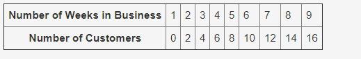
A scatter plot is made with the data shown:
 Cupcake123456:
What type of association will the scatter plot for this data represent between the number of weeks in business and the number of customers? No association Positive linear association Negative linear association Positive nonlinear association
Cupcake123456:
@bill533
Cupcake123456:
would it be negative linear ? i think it is but not 100% sure
 InsatiableSuffering:
Ok so, if you were to graph this out, recall what the axes would have. The x axis would represent the number of weeks in business, while the y axis is the number of customers. Think of it this way. Customers are dependent on when the businesses are open. Nobody goes to a store when it's closed. That's why the number of customers is dependent on the number of weeks in business, rather than the other way around. Therefore, that's why the axes are labeled as they are. Now by graphing the points, you can even create an equation from this. This equation would be in the form of y=mx+b. The equation that can be derived from this table after plugging in the points is y=2x-2. So knowing this, in order to find your answer, look at the mx part of the equation and decide from there if it is a negative or positive association.
Join our real-time social learning platform and learn together with your friends!
 Bounty:
the world keeps moving fast and I'm stuck in a time lapse all I need is a minute
Bounty:
can I get so tips on how to start my journey into semi-realism art also on how to
Bounty:
the world keeps moving fast and I'm stuck in a time lapse all I need is a minute
Bounty:
can I get so tips on how to start my journey into semi-realism art also on how to
 Strawberryluna:
Read my poem. Im not for criticism its a poem I wrote after my breakup: Youu2019ll never understand the way you made me break, I hate that I still love you
Bounty:
first poem in a min- (tittle)? one moment i'm fine I smile till my face burns I laugh till I cant breath Then I cry I wonder where I went wrong I listen to
Strawberryluna:
Read my poem. Im not for criticism its a poem I wrote after my breakup: Youu2019ll never understand the way you made me break, I hate that I still love you
Bounty:
first poem in a min- (tittle)? one moment i'm fine I smile till my face burns I laugh till I cant breath Then I cry I wonder where I went wrong I listen to
 Twaylor:
3d printing a glider (for 150 pound 5'8 person - prolly should make it for up to
Twaylor:
3d printing a glider (for 150 pound 5'8 person - prolly should make it for up to
 cullenn:
pitter patter sound of rain gently tapping my window tonight. calming, soothing, right? not for me.
cullenn:
pitter patter sound of rain gently tapping my window tonight. calming, soothing, right? not for me.

 Arriyanalol:
DON'T BUY TICKETS TO SEAWORLD i watched a documentary on seaworld and its sad wha
Arriyanalol:
DON'T BUY TICKETS TO SEAWORLD i watched a documentary on seaworld and its sad wha
 natalieee:
who else wants a job in biology? I love biomedical science and want to work with
natalieee:
who else wants a job in biology? I love biomedical science and want to work with