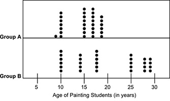
The dot plots below show the ages of students belonging to two groups of painting classes: A dot plot shows two divisions labeled Group A and Group B. The horizontal axis is labeled as Age of Painting Students in years. Group A shows 1 dot at 9, 7 dots at 10, 8 dots at 15, 8 dots at 17, and 6 dots at 19. Group B shows 6 dots at 10, 5 dots at 14, 6 dots at 18, 5 dots at 25, 4 dots at 28, and 4 dots at 29. Based on visual inspection, which group most likely has a lower mean age of painting students? Explain your answer using two or three sentences. Make sure to use facts to support your answer.
do you want me to put up a pic ?
 AZ:
AZ:
So let's say, I have two groups of numbers Group A has the numbers 10, 10, 10, 11, 11, 11, 12, 12, 12 and Group B has the numbers 1, 1, 1, 2, 2, 2, 3, 3, 3 can you calculate the mean for both of these groups? Remember to calculate it, you add up all the numbers and divide by how many numbers there are and if we were to plot out the numbers |dw:1620867167126:dw|
AZ:
so based on this example I just gave you with those numbers, can you see which graph has the higher mean based on where the numbers are plotted?
AZ:
So can you use that to answer your question? Which one would have a higher mean? It's going to be the one that has the larger numbers
Join our real-time social learning platform and learn together with your friends!
 natalieee:
who else wants a job in biology? I love biomedical science and want to work with
natalieee:
who else wants a job in biology? I love biomedical science and want to work with
 Twaylor:
Time flies doesn't it? I tried to not be the second squeaky wheel of the household and ended up hurting myself and others severely.
Twaylor:
Time flies doesn't it? I tried to not be the second squeaky wheel of the household and ended up hurting myself and others severely.
 clllaaaaaire:
any tips? the quality isn't the best because I am using this site on my computer
clllaaaaaire:
any tips? the quality isn't the best because I am using this site on my computer
 Midnight97:
Kinda a roleplay story between me and my friend enjoy... Part one Forgive me for all the screenshots.
Midnight97:
Kinda a roleplay story between me and my friend enjoy... Part one Forgive me for all the screenshots.
 StevenisGhost:
what type of song should I make next, and will y'all go check out my new song on
Midnight97:
My drawing sure changed over the years look at these two pictures from 2024 to no
StevenisGhost:
what type of song should I make next, and will y'all go check out my new song on
Midnight97:
My drawing sure changed over the years look at these two pictures from 2024 to no
 EdwinJsHispanic:
"poem" love is So Beautiful to have. But it's so hard to have. At this point I don't know whether its worth the wait Or if it's just millions of miles to re
EdwinJsHispanic:
"poem" love is So Beautiful to have. But it's so hard to have. At this point I don't know whether its worth the wait Or if it's just millions of miles to re
EdwinJsHispanic:
"poem" love is So Beautiful to have. But it's so hard to have. At this point I don't know whether its worth the wait Or if it's just millions of miles to re
EdwinJsHispanic:
"poem" love is So Beautiful to have. But it's so hard to have. At this point I don't know whether its worth the wait Or if it's just millions of miles to re