 Sailor:
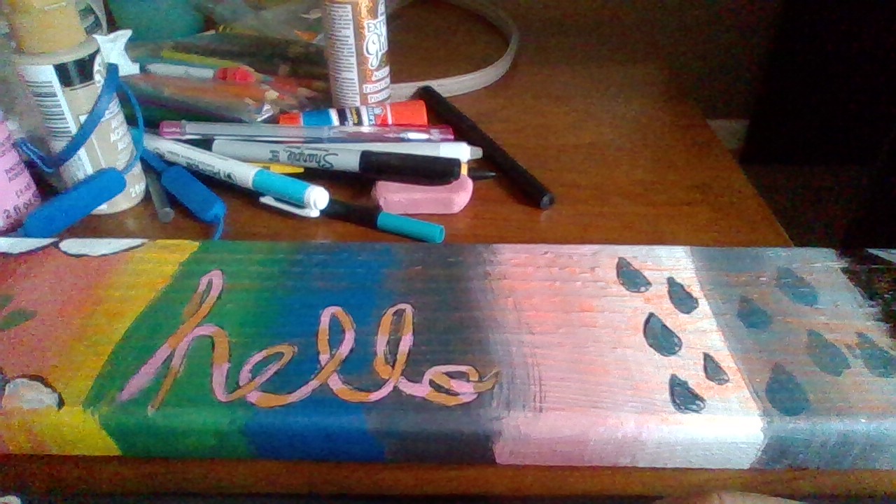
I made something for an art class can you be honest and tell me how it looks? I have to post it in the comments so give me a minute...
 Sailor:
I wasn't able to fit it in the camera qwq
 JamesTDG:
I might recommend smoothing the transition between each color a bit, but tbh, all I think it needs is a thicker border on the text
Sailor:
JamesTDG:
Oh, uh, as a reminder for the future, having the colors be diagonal will make the job of transitioning the colors easier.
Sailor:
 AN0NYM0US:
Yes rotate the colors Horizontally it will make it look better than just Making it diagonal.
Sailor:
AN0NYM0US:
Play with contrast utilizing photograph altering PC programming and improve each tone on the picture. We perceive protests all the more rapidly when their tones reflect what we find in the actual world. After seeing an item that is shaded in an unexpected way, similar to a pink banana, it can cause intellectual cacophony that the watcher should resolve. Obviously, you may deliberately utilize strange tones as an imaginative, perky or noisy methodology. Yet, on the off chance that your focusing on expedient acknowledgment, as in this cover for a kids’ book, use colors that are regularly connected with an article or scene.
 Astrid1:
Me likes <3
 tahyla:
it looks good but needs blending and the rain droplets they need more shape but overall good
Sailor:
tahyla:
ok
 SallyUwU:
OOOOOOOOOOOOO RAINBOWS i like it :D
Sailor:
 kai6665:
i luv rainbows :00000 great job
Sailor:
kai6665:
your welcome :>
Join our real-time social learning platform and learn together with your friends!
 Twaylor:
Time flies doesn't it? I tried to not be the second squeaky wheel of the household and ended up hurting myself and others severely.
Twaylor:
Time flies doesn't it? I tried to not be the second squeaky wheel of the household and ended up hurting myself and others severely.
 clllaaaaaire:
any tips? the quality isn't the best because I am using this site on my computer
clllaaaaaire:
any tips? the quality isn't the best because I am using this site on my computer
 Midnight97:
Kinda a roleplay story between me and my friend enjoy... Part one Forgive me for all the screenshots.
Midnight97:
Kinda a roleplay story between me and my friend enjoy... Part one Forgive me for all the screenshots.
 StevenisGhost:
what type of song should I make next, and will y'all go check out my new song on
Midnight97:
My drawing sure changed over the years look at these two pictures from 2024 to no
StevenisGhost:
what type of song should I make next, and will y'all go check out my new song on
Midnight97:
My drawing sure changed over the years look at these two pictures from 2024 to no
 EdwinJsHispanic:
"poem" love is So Beautiful to have. But it's so hard to have. At this point I don't know whether its worth the wait Or if it's just millions of miles to re
EdwinJsHispanic:
"poem" love is So Beautiful to have. But it's so hard to have. At this point I don't know whether its worth the wait Or if it's just millions of miles to re
EdwinJsHispanic:
"poem" love is So Beautiful to have. But it's so hard to have. At this point I don't know whether its worth the wait Or if it's just millions of miles to re
EdwinJsHispanic:
"poem" love is So Beautiful to have. But it's so hard to have. At this point I don't know whether its worth the wait Or if it's just millions of miles to re
 Breathless:
I don't know if this would be considered art, but its close enough I believe, Any
Breathless:
I don't know if this would be considered art, but its close enough I believe, Any